


Get all our templates, tips, and fresh content so you can run effective, profitable, low-stress projects in your agency or team.
What is a project management dashboard?
A project management dashboard is a display of data that tracks project progress by showing the current status of various parts of a project.
Sounds complicated?
The instructions and examples in this post will simplify all that and set you up to create your own project dashboard, 1-2-3.
Let’s start with how your agency is doing right now.
Do you know exactly how your projects are doing? Can you tell which tasks are delayed and which are ahead of schedule? Which of your resources is falling behind?
Unless you have a capable project dashboard, you likely answered ‘no’ to all these questions.
A project dashboard (or any dashboard for that matter) is super important in giving you unprecedented visibility into your work. Instead of digging through spreadsheets and submenus, a dashboard helps you track your most important metrics easily, often in real time.
The result? Faster decision-making and better insight.
To build a project dashboard, you first identify the right metrics. Then, you combine them in a way that is accurate, relevant, and easy to understand.
In this guide, you’ll learn about the core ingredients of a successful dashboard, what metrics to use, and how to bring it all together.
What is important to include in a Project Dashboard?
A good project dashboard includes a collection of metrics arranged in an easy-to-grasp, mostly visual manner.
Think of it as a project report, but one that is updated either in real-time or at fixed intervals, automatically.
The chief utility of a dashboard is that it brings in relevant data from multiple sources in a friendly format.
A marketing dashboard, for instance, might bring in traffic data from Google Analytics, social media data from HootSuite, and PPC data from AdSense. You can technically access all this data independently, but it takes too much effort to do it on a regular basis.
A good dashboard - and this applies to everything from project management to marketing - has a few common features:
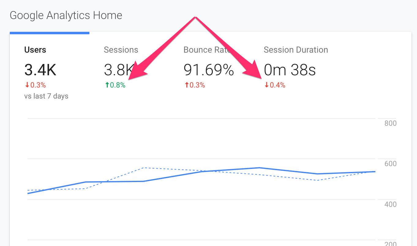
1. Visual
The hallmark of a good dashboard is its visual friendliness. Data that is otherwise hard to grasp (such as long numerical tables) is converted into easy-to-read graphs and charts. Trends and movements are highlighted via colors and motion.
A common theme, for instance, is using the red color to highlight a drop and the green color for growth. This tells the user at a glance whether a metric is going up or down.
It’s not enough to be visual, of course; the dashboard should also be scannable. A user should understand trends, differences, and movements at a glance. Simple changes such as using two contrasting colors for two separate quantities can improve scanning drastically.
2. Relevance and Customizability
A dashboard that tracks metrics no one cares about is a dashboard that’s not fulfilling its purpose. More than anything, your dashboard must track the right metrics, for the right person, at the right time.
The problem, of course, arises when competing interests get down to defining the “right metrics”.
This is where your homework before you start creating the dashboard becomes crucial. It’s not enough to simply plug together a bunch of APIs in a visual manner; you also have to build consensus among all interested parties.
Essentially, your project dashboard should be relevant to the user. Don’t show the CEO the same metrics as you would show the project manager. Create separate dashboards for different roles.
A Gantt chart is a relevant way to display completed and upcoming tasks, but isn’t useful for displaying profit per client.
At the same time, offer them some customization options. If a user wants to look at task completion rate month-over-month instead of daily, give them the option to do so.
Just be careful to not offer too many customization options - it’ll only lead to confusion.
3. Accuracy
It goes without saying that any dashboard you create should be accurate.
Accurate data sources help a great deal in this regard. If you can club the same data from multiple sources (say, getting website traffic data from both Mixpanel and Google Analytics), you can eliminate some of the errors in the measuring source.
More importantly, the dashboard should only read data, not modify it.
4. Update Frequency
A good dashboard is updated just often enough to be useful. You might be tempted to update every metric in real time. But unless you’re dealing with a massive volume of rapidly changing data, real-time updates are a waste of resources.
Instead, consider how often the actual data changes. In a project dashboard, resources might log in their hours worked only at the end of the day. Updating this metric every hour is useless. Instead, you can set it to update only once every 24 hours.
At the same time, consider how often the end user will check the dashboard. If the dashboard is to be reviewed only once a month, spending resources on real-time or even daily updates might be a waste.
In other words, your update frequency should match a) the update frequency of the data, and b) the access frequency of the dashboard itself.
Most importantly, a dashboard is there to make your life easier, give you more time to do the things you enjoy, and get you home earlier for supper!
Keeping all these factors in mind, let’s break down the actual process of creating a project dashboard into easy-to-understand steps.
How do you build a Project Dashboard?
The process of building a project dashboard can be technically challenging. You need data in the right format and the ability to turn it into actionable insight.
However, more than the technical challenges, what hampers most endeavors is a poor understanding of what the dashboard should actually do. A dashboard that shows the wrong data in the wrong format doesn’t help anyone.
Your first step, therefore, should be to figure out exactly what you need and, more importantly, why you need it.
How do you choose what to put on a project management dashboard?
Before you decide what to put on your project dashboard, get clarity on these 5 things:
-
The purpose of the dashboard
Good dashboards are always purpose driven. They measure specific things for specific users. A finance-focused project dashboard will take a very different shape than an operations-focused project dashboard.
Thus, the first two things you need to define are:
- The target user of the dashboard
- The intent and purpose of the dashboard (i.e. what it will be used for)
-
The data you’re currently tracking
Project dashboards, of course, depend on data. But not all this data is equally useful or usable.
Start by making a catalog of all your data sources. What data are you currently tracking across all your systems? What format is this in? Can you plug it directly into your dashboard system?
Next, make a list of your KPIs (Key Performance Indicators). This should include KPIs specific to that dashboard, as well as KPIs you track for all other parts of the business.
-
The dashboard format
When it comes to the dashboard format, you have to answer three questions:
- Who will access the dashboard? What are their top requirements?
- How often will they access the dashboard?
- Where will they access the dashboard?
Much depends on the answers to these questions. A dashboard that’s accessed just once a month can be in the form of a static report. One that’s accessed daily should be accessible via a shared URL.
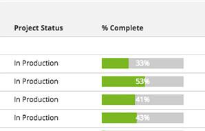
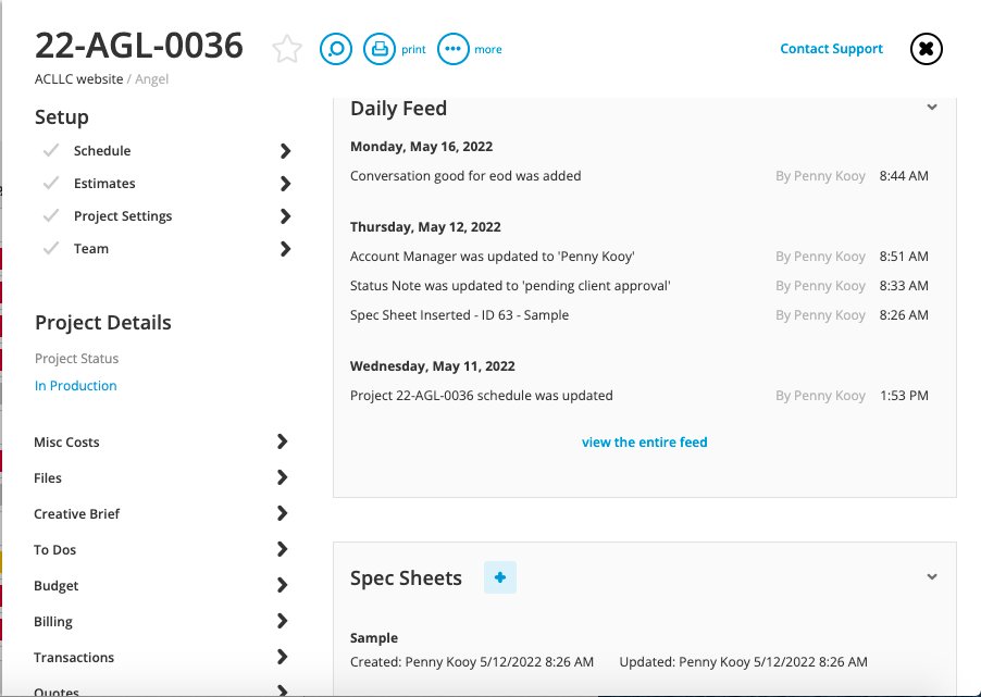
Workamajig shows important information such as task/project status in easy to read visual formats
Similarly, if your users don’t need freshly updated data, a static dashboard will do fine. Else, you’ll want to offer them a dynamic dashboard with some customization capabilities.
-
Style considerations
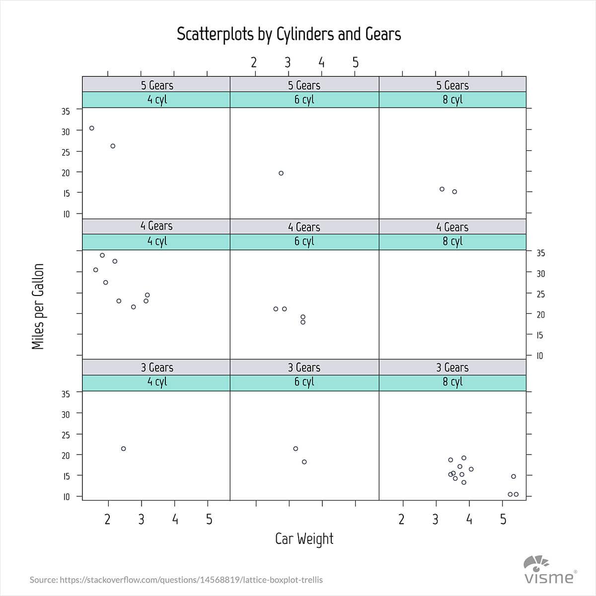
Apart from the format, also consider the style of the project dashboard. Think of the target users who will access the dashboard. What level of complexity do they prefer in their graphs? Do they have the technical know-how to read Trellis Plots or should you make do with a simpler bar graph?
Trellis plots are great for engineering calculations but you won’t find much use for them on a financial dashboard (Image source: Visme)
Also, consider the colors and themes. Does the dashboard have to follow any corporate colors? Do the target users prefer a certain aesthetic? Are there any accessibility issues you need to worry about?
In general, it’s a good idea to make your dashboards as easy to read as possible. Clarity trumps cleverness in any project dashboard.
-
The tools you have access to
Finally, consider the tools you have access to or are comfortable using (which might not always be the same). Excel is the default tool for any kind of statistical endeavor, but creating dynamic dashboards in Excel requires a lot of technical expertise.
A solid project management system like Workamajig can help you create detailed dashboards from the data you already have.
Project Dashboard Examples
Now that we’ve explained what a project dashboard is, you’ll want to see some examples of what a good dashboard actually looks like.
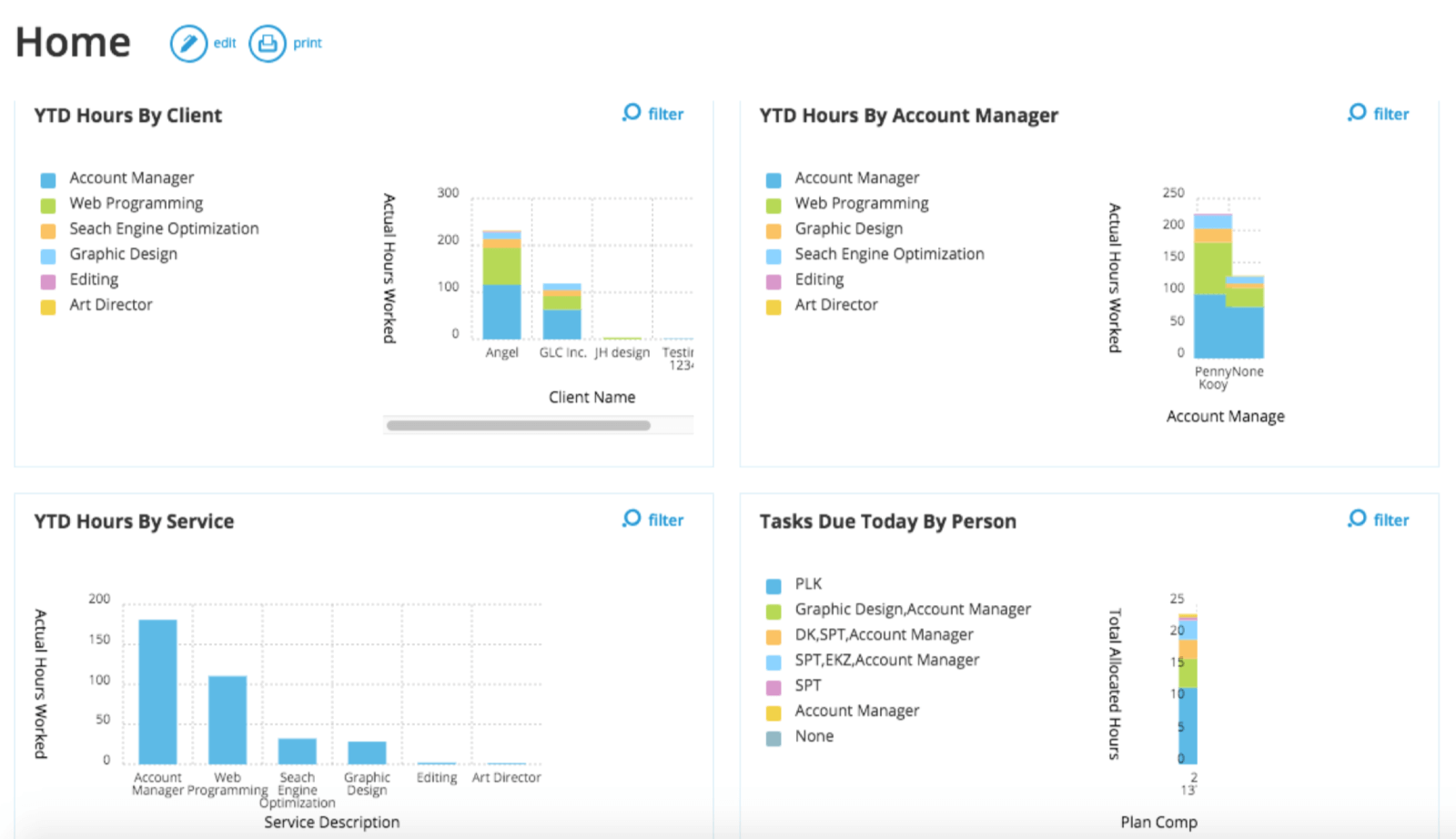
Below is an example of Workamajig’s management dashboard. This dashboard can be customized to suit all your agency's requirements. It gives you an all-round insight into how a range of projects are progressing by showing you how your agency is doing by client, account manager, and service.
The following is an example of a Workamajig dashboard that is specific to one particular project-what we’d call a project dashboard.
Types of Project Dashboard
Different types of dashboards are useful for different things, at different times, and at different agencies. But don’t panic! There are only three main types of dashboards:
-
Operational dashboards
This dashboard type is constantly updated with data, such as ROI on digital advertising, the health of your social media channels and website performance metrics.
Operational dashboards tell you what is happening here and now and can help make important decisions about where time and money should be invested.
-
Analytical dashboards
With this type of dashboard, users can see data trends such as an increase of users on a particular service, efficiency of agency spending, and yearly revenue provided by every customer.
Analytical dashboards may sound like a hard thing to build, but with the abundance of easy-access analytical tools, this type of dashboard can be built by anyone.
-
Strategic dashboards
Strategic dashboards are an executive's best friend as they allow a sweeping view into KPIs (key performance indicators), allowing various metrics to be analyzed easily.
Executives can use strategic dashboards to measure the performance of things like finances over different periods of time, EBITDA (earnings before interest, tax, depreciation, and amortization), and the growth of MRR (monthly recurring revenue).
Combine all three for an ideal project management dashboard
With an efficient project management tool, like Workamajig, operational, analytical, and strategic dashboards can be easily combined. With this combined insight, you will have the power to make wise decisions that otherwise would not have been made strategically.
So, how do I actually create my project management dashboard?
Much will depend on how you collect your data (and how you store it) and the tools you have access to. What works for one agency might not work for another.
Although there is no clear and direct path to creating a project dashboard, here are some general tips and best practices that apply to every project dashboard, regardless of the tools you use:
-
Collect and curate your data
Start by making a catalog of all your data sources. For each source, also identify what format you can export the data in. CSV is the most common format since it can be readily used in Excel, Google Sheets, and other dashboard tools.
This screenshot from Google Analytics shows the different formats you can use to export data
Make a list of all the data sources and identify their formats. You might have something like this:
- Web traffic data - CSV format
- Financial data - CSV and PDF formats
- User data - SQL database
Most dashboard tools should let you use data in multiple formats. But if that’s not the case, you’ll want to figure out a way to convert the data and make it compatible with your dashboard tool.
Alternatively, you can use a tool like Workamajig to automatically gather your most important project management data and turn it into a dashboard.
-
Identify your top metrics
From each of your data sources, identify your top metrics and their update frequency. The latter is particularly important for figuring out whether you can make do with a static dashboard or if you need a dynamic one.
For instance, project financial data doesn’t change rapidly on a daily basis. But the list of tasks completed can change a lot in a day. A weekly static dashboard that focuses on the latter will be nearly useless. If you want to highlight such metrics, try using a dynamic project dashboard instead.
-
Identify the right element and design for each metric
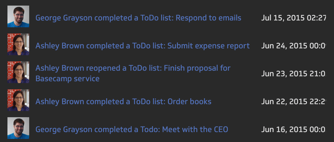
Next, for each of the metrics you identified above, list the right graphical and your chosen design. Again, this will depend on your target users and the format of the metric itself. A list of upcoming to-dos is best represented as, well, a list. Productivity over time is better shown as a line graph.
For each metric, also identify the “must have” design element. For instance, you might want to show your first name, task name, and profile picture in your list of upcoming and finished to-dos.
The above screenshot shows a sample task list with the owner of each task, the task name, and their profile pictures. (Image Credit: Klipfolio)
-
Create your dashboard layout
The final step is to think of the dashboard layout, i.e. how you will organize the data in the dashboard.
There are a few usability heuristics you should follow:
- Larger elements draw more attention. Thus, make your most important KPIs the largest elements on the dashboard.
- People read from left to right and top to bottom. Your most important metric should be in the top left corner, and the least important in the bottom right.
- Use familiar colors (such as red for loss, green for profit) and easy-to-read fonts to improve legibility
Search Pinterest for dashboards for inspiration. It’s best to borrow established design norms than to reinvent the wheel.
The final step - bring all the data together in your dashboard tool. Place the right metric in the right spot in your layout, use the correct design, and hey presto-you’re ready to share it with your users!
BUT!
While a project dashboard can bring a great deal of visibility and insight into your projects, it can also be hard to create, especially if you have to bring in data from multiple sources. A project management system such as Workamajig not only helps you track vital project data but also integrates with other tools you already use.
The end result is a powerful and flexible project dashboard that isn’t just easy to create, but also easy to customize.
Try Workamajig for yourself to see how it can transform the way you run your projects.