It seems that there is always confusion the first time someone rolls up on an agile methods burn down chart:
- What are we burning?
- How much is there to burn?
- How long does it take?
- What is the starting point?
- When does it end?

An analogy
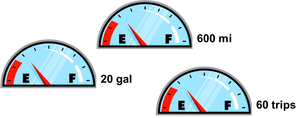
Think of a burn down chart in the same way you regard the fuel gauge in your car:
- You fill up the tank
- You drive around, consuming fuel
- Eventually, it the fuel runs out, the gauge shows empty, and the car stops
- The gauge, if it has any metric calibration at all, probably says "full" at the top.
- Let's say that "full" is 20gal (US) or about 75ltr. So, the gauge could read 20gal instead of "full".
- But, if the car gets 30mi/gal, then the gauge could read 600mi (965km) when "full" instead of 20gal. Some driver digital display systems give such measures
- But, if you drive about 10mi (round trip) every time you run an errand, go shopping, go to a restaurant, etc, then the gauge could read 60 trips when "full" instead of miles or gallons. Naturally, when the gauge gets to 1/2, then you've got 30 trips left in the tank.
- Typically, we're burning some consumable resource, like hours (gallons of fuel), to empty the backlog (tank)
- When the backlog runs out, we stop
- But, we could look at some velocity, a rate of consumption, like stories per hour (miles per gallon)
- Or, we could look at the number of stories (trips to the store) we expect to complete if we burn all the hours (fuel)
Buy them at any online book retailer!