
 I’ve found project risk management to be one of the weakest performed PMBOK knowledge areas in most organizations, even for those companies whose operational risk management practices are very mature. A part of this challenge is that we tend to identify obvious risks but miss key ones when we don’t engage sufficient stakeholders in the identification process or when we ignore lessons identified in past projects. But another major source of issues is the lack of meaningful response to identified, analyzed risks.
An article from the October 2017 issue of PM Journal reminded me that HOW we communicate risk information is as important as WHAT we communicate.
I’m sure many of you recognize the futility in only sharing risk information via risk registers. While those are a valid place to consolidate risk information for project management purposes, it is unlikely that most stakeholders will know where to locate a risk register for a project, let alone review it periodically. A better approach would be to use existing information radiators, reports or meetings to secure ownership of actions and responses for key risks.
But how do we present the information itself?
Extracting key fields from the risk register into a management-ready table is one way to do this. You might also be creating some colorful heat maps to provide stakeholders with a higher level view of overall risk probability and impacts.
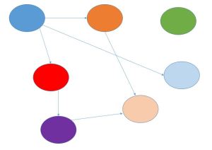
But what about the relationships between risks?
You might have communicated some information regarding the secondary risks generated by responding to other risks, but what about the relationships between the risks in your register?
Creating a visual representation of the relationship between risks can help us focus further analysis and response efforts on those risks where we will get the greatest overall project benefits. An interrelationship digraph which was one of the quality management tools covered in the Fifth Edition of the PMBOK Guide and excised from the Sixth Edition provides one way to do this. Such a view might also help key stakeholders to connect the dots for themselves. They can visualize how their response to a specific risk might help to prevent impacts resulting from the realization of other risks triggered by the first one.
Our project risk management practices are only effective if there is a tangible difference in outcomes compared with our doing nothing.


Pingback: In defense of the Digraph – Best Project Management Sites in One Place
Pingback: New PM Articles for the Week of October 30 – November 5 - The Practicing IT Project Manager