Pivot Tables in Excel offer a multitude of options for analyzing and interpreting large datasets. One of the most powerful features is the ability to filter data to zero in on specific details. Using the example of a fictitious ice cream company, “Excellent Ice Cream”, let’s walk through the nuances of filtering within Pivot Tables.
Introduction to Filtering in Pivot Tables
To provide a tangible example, I crafted three pivot tables with corresponding charts to showcase sales data of the company. While the charts were more of an aesthetic touch, the tables hold the essence of our discussion.

At first glance, each pivot table provides a distinct insight:
- Revenue by flavor
- Number of orders by flavor
- Production costs by flavor
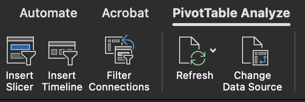
The Dropdown Arrow: A Basic Filtering Tool
A simple yet effective way to filter data within these tables is by using the dropdown arrow that each pivot table possesses. By clicking on this arrow, users can select or deselect specific criteria, focusing only on the data they are most interested in.
The Filters Box: An Advanced Perspective
However, for those desiring more advanced filtering, Pivot Tables offer the ‘filters box’. This tool might look confusing, especially since its purpose seems to overlap with the dropdown arrow. Yet, its true potential shines when dealing with multifaceted data.
Using our ice cream company’s location data as an example, by dragging the ‘customer location’ column into the filters box, we introduce an advanced filtering layer. This filter sits atop the pivot table and allows users to refine data based on specific stores or locations. For instance, selecting ‘LA’ will filter all insights to represent only those from the Los Angeles store. Additionally, the ‘multiple items’ option provides a way to view data from several locations at once, albeit with the limitation of not specifying which locations are selected.
Synchronized Filtering Across Multiple Tables
It’s crucial to remember that the filters box affects only the pivot table to which it’s applied. If working with multiple tables that require the same filtering criteria, one would need to manually replicate the filter for each table.
Pivot Tables come with an impressive versatility that often goes unnoticed. Notably, it’s possible to apply more than a single filter. For instance, you might wish to filter data by both customer location and product type. Each filter is applied successively, refining the dataset based on multiple criteria. However, if you’re dealing with several pivot tables, remember to apply these filters individually.
To remove a filter, simply drag the desired column heading from the filters area back to its original place. The pivot table doesn’t automatically revert to its original position; it stays where you adjusted it last, a small hiccup but not a showstopper.
The classic method of applying a filter is straightforward, but there’s an alternative that many find even more compelling: Slicers.
Embracing the Power of Slicers
Slicers can be aptly described as “filters on steroids.” This modern-day tool provides an intuitive interface, which makes filtering not just effective, but also visually appealing. It’s the 21st-century twist on the conventional dropdown filtering method.
To insert a Slicer:
- Click within the pivot table you wish to filter.
- Navigate to: Pivot Table > Analyze > Insert > Slicer.
- Choose the columns you wish to use for the Slicer. For example, “Customer Location”.
Slicers are, by default, placed in the center of your screen but can be easily moved. Unlike traditional filters that must sit directly above the pivot table, Slicers float freely. They exist in a separate layer, akin to charts, allowing you to position them wherever you prefer, even on different sheets.

The real beauty of Slicers lies in their user-friendliness. A single click is all that’s needed to apply a filter. Say goodbye to the tedious three-click method of old-style filters. Slicers are also particularly handy for touch devices like iPads. Their large, easy-to-click buttons make them a favorite for those with bigger fingers or those navigating on smaller screens.
Want to view data from multiple locations? With Slicers, it’s a breeze. Click on your first choice, hold down the control key, and make your additional selections. Your selected options are highlighted, providing clarity at a glance.
To revert to the full dataset, clear the Slicer with a simple click on the button with the red cross. It’s a testament to how Microsoft has refined the user experience over the years, optimizing processes for both efficiency and convenience.
Linking One Slicer to Multiple Pivot Tables
By default, when you introduce a slicer, it’s connected to the pivot table within which it was created. But what if you could use this single slicer to filter multiple tables simultaneously? Gone would be the repetitive and tedious cycle of ‘click the arrow, choose New York, click OK’ for each table. Instead, a single click would suffice.
To accomplish this, you first need to be acquainted with the naming convention of pivot tables.
Identifying Your Pivot Tables
Each pivot table in Excel is assigned a unique name, which helps in differentiating and referring to them. To determine the name of a pivot table:
- Click anywhere within the desired pivot table.
- Navigate to the
Analyzetab. - Observe the left side of the ribbon, and you’ll see the pivot table’s name displayed.

Excel sequentially numbers pivot tables based on the order they’re created. So, the first one might be named ‘PivotTable1’, the second ‘PivotTable2’, and so on. While these default names are descriptive enough, you can rename them to something more specific, though, for brevity, we won’t delve into that here.
Connecting the Slicer
Once you’re aware of your pivot tables’ names:
- Select the slicer to activate its specific menu.
- On the slicer menu, choose
Report Connections. - A window pops up, listing all pivot tables in the current file, not limited to the active sheet. Alongside each pivot table’s name, you’ll see checkboxes.
- Simply check the boxes corresponding to the pivot tables you wish the slicer to control. For instance, if you have three pivot tables and wish to connect the slicer to all of them, ensure all three boxes are ticked.
- Click
OK.
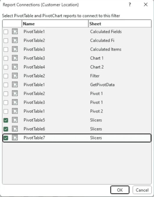
Now, any change or filter you apply using the slicer will be simultaneously reflected across all connected pivot tables. Whether you select ‘New York’ or ‘Houston’, each pivot table will adjust according to your selection. And it’s not just the tables that update; connected charts shift in real-time too, offering a seamless experience.
Stylizing the Slicer
Excel provides numerous design templates to style your slicer. To access them:
- Select the slicer to activate the slicer-specific menu.
- Navigate to the
OptionsorSlicer Menu, depending on your Excel version. - Browse through the color styles available. Choose one that complements the look and feel of your document.

Editing the Slicer’s Caption
Above the slicer buttons, there’s a default caption. Personalizing it can offer clarity. For instance, if your slicer filters by cities, naming it “City Filter” can enhance user experience.
- On the slicer menu, locate the ‘Caption’ input field.
- Type in your desired caption. The new name will replace the default title.
Resizing and Adjusting the Slicer Layout
By default, the slicer displays its buttons in a single column, which can make it vertically elongated. But with a few tweaks, you can change its orientation and layout:
- Under the
Buttonsgroup on the slicer menu, there’s an option for ‘Columns’. - Adjust the number of columns to display your buttons. If you have seven filter options, setting it to seven columns will present them in a horizontal row.
- Resize the slicer’s frame by dragging its edges. For a horizontal layout, widen it and reduce its height.

Positioning for Better Accessibility
After customization, position the slicer for optimal user access. Given its newfound horizontal layout, place it atop your dashboard, spanning the width of all pivot tables. The result is a clean, unobtrusive filter bar that doesn’t dominate your screen but remains easily accessible.

A Quick Tip:
If someone wonders how to achieve a horizontal slicer, it’s not about a hidden setting. It’s about resizing and adjusting column numbers. The slicer’s flexibility is inherent; users simply need to mold it as they see fit.
This article contains highlights from Mike Thomas’s webinar – From Raw Data to Actionable Insights – Mastering Pivot Tables – being provided by MPUG for the convenience of our members. You may wish to use this transcript for the purposes of self-paced learning, searching for specific information, and/or performing a quick review of webinar content. There may be exclusions, such as those steps included in product demonstrations, or there may be additions to expand on concepts. You may watch the on-demand recording of this webinar at your convenience.

Elevate your project management skills and propel your career forward with an MPUG Membership. Gain access to 500+ hours of PMI-accredited training, live events, and a vibrant online community. Watch a free lesson and see how MPUG can teach you to Master Projects for Unlimited Growth. JOIN NOW