I was once in a restaurant.
The location was good, the décor and ambience very acceptable, the company most enjoyable, and the snow fell softly outside providing a winter wonderland visual delight through the large windows.
But sadly all of that positive build-up for a great evening’s dining was almost outweighed by the food and service.
After an initial ordering experience the diners elected to eat the same main course but each agreed that the chef’s vegetable of choice for the evening was not to their personal liking. It was the humble Brussels sprout, a member of the brassica family that enjoys a somewhat tarnished image which, considering its status as a nutritional powerhouse, is perhaps a little unfair.
Anyway the request was made to replace said evil vegetable with an alternative, and asparagus tips were requested. And so the meal continued through a mediocre appetizer and on until the main course finally arrived … without Brussels sprouts (the good news) but also without anything in their place as requested (the bad news).
The waiter was recalled and cajoled and encouraged to resolve this rapidly, at which the staff applied all of their skills and training, by ignoring us and disappearing. Eventually after a long period, during which most of the meal was consumed, the waiter did reappear and proceeded to almost, but not quite, save the entire situation.
With a silver platter and a silver fork of delicate proportions the waiter proceeded to ceremoniously, and with great flourish, place two small asparagus tips across the centre of each diner’s remaining half-eaten meal.
It was theatrical and exaggerated and, had it not been for the sheer humour of the whole thing, he may just have got away with it. Presentation can win the day.
My friends from Office Timeline have some useful thoughts along these lines, well less about dining and waiters but more about impressive presentations to your clients and your executives:
Project Software for Presentations That Stand Out in Meetings
Even when relying on dense, data-rich content, business presentations can still be interesting for the audience if they come in the right package. The key to it lies in simplicity and relevance, along with the suitability of the media chosen to address the given audience. In other words, extracting what matters the most and presenting it in a proper format ensures the success of a presentation, no matter its nature.

Simple Yet Stylish Project Visuals to Impress Your Audience
A good presentation grabs the audience’s attention, sends a clear message, and maintains the participants’ interest alive throughout its entire duration. This may seem intimidating and unrealistic for project planners who need to showcase content that is a bit more technical, especially if it’s a report or overview of a complex project. But it shouldn’t be so. Just because the presentation relies on dense material, it doesn’t have to end up with a bored audience or an output too complicated to understand on the spot.
Another factor that can make things even harder is the need to prepare joint presentations for the regular executive or client meetings. For instance, let’s say you and the project managers from other divisions are preparing the executive status reports for each of your projects. Your counterparts have finished presenting their well-documented reports, which were apparently produced using Microsoft Project or Excel and pasted into a PowerPoint slide. Now it’s your turn and you want to keep the same presentation format, but have a feeling that the audience is not going to appreciate any more charts and numbers.
Your team and colleagues all use MS Project and Excel, if not some other specialized project management programs such as Wrike or Smartsheet as well. Although you work with such software regularly, you wouldn’t use it for the due summary level presentation just because a previous presenter has done it. In such cases, a simple, familiar visual slide that shows only key data will help you get your message across and stand out.
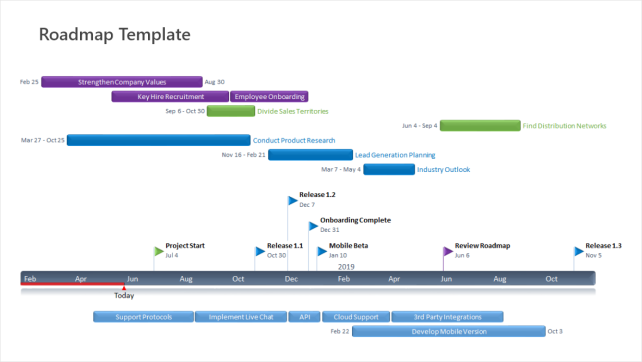
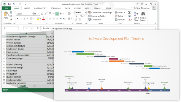
Aiming to help business professionals who need to present their projects in a comprehensible way, Bellevue-based software developer Office Timeline offers a lightweight Gantt chart and timeline maker add-in for Microsoft PowerPoint that helps turn complex information into neat PowerPoint slides that show the big picture. The plug-in allows project planners to import data from any of the tools mentioned above and will update the results based on new input with a mouse click.
Powerful Data Processing for a Presentation-Ready Output
The key benefits of the Office Timeline software are not restricted solely to its broad data integration capabilities. While flexible and easy data-gathering is invaluable, the real advantage is in how that input can be presented so that it is visualized by the audience in the most impactful format possible.

With a variety of built-in and downloadable templates to choose from, Office Timeline allows project managers to easily preview the impact of each timeline or Gantt chart style and then quickly tailor the visual to match their audience. Forget about the standard, inflexible timelines. The PowerPoint add-in helps users to make the data speak for itself with just minimal input. Countless adjustments can be made to the timeline, one object at a time or all at once.
See How Easy Is to Get Started
With simple to use controls, integration with popular PM tools, and numerous customization options, Office Timeline enables users to quickly turn complex data into easy-to-grasp visuals that stand out in meetings.
Try Office Timeline Plus Free for 14 Days
Tags: change, communication, office timeline
Leave a comment