
This article elaborates on a webinar segment in which I dissected the application of pivot tables using a sales dataset from an ice cream manufacturing company. Remember, this demonstration isn’t confined to sales data alone; the discussed techniques can be universally applied to any dataset.
In this particular instance, I was tasked to generate two types of reports. The first one required a detailed breakdown of the company’s revenue, costs, and profit by individual ice cream flavors. The second report aimed at providing a revenue breakdown by flavor and specific location. To create these, I initially used an array of complex formulas to manually construct these reports.
Nonetheless, it’s worth noting that pivot tables can accomplish similar results, perhaps more efficiently. The pivot tables I generated for this data bore an uncanny resemblance to the manually created reports. However, there’s an easy way to distinguish a pivot table from a regular one – the presence of two additional menu options and a panel that appears on the right side of your screen when you interact with a pivot table, which doesn’t happen with manual tables.
Creating a Pivot Table
Let’s now focus on how to create a pivot table. For this tutorial, I will use a blank sheet, ‘Pivot Three’, but remember that multiple pivot tables can reside on a single sheet. As an example, I previously placed two pivot tables on the ‘Pivot One’ sheet. On ‘Pivot Three’, I aim to create between one to three pivot tables.
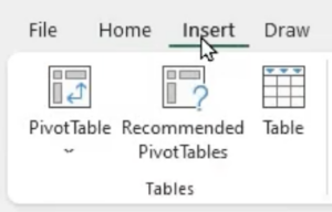
To create a pivot table, navigate to ‘Insert’ and then ‘Pivot Table’, which will prompt a dialogue box.
This box will ask two key questions: Where is your data located, and where do you want the pivot table to be placed?
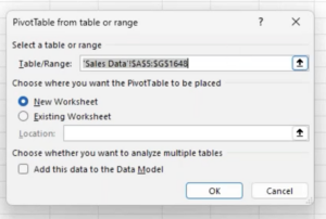
For the data’s location, Excel typically identifies it for you. In this case, it correctly recognized our data range from A5 to G1648 on the sales data sheet. On the off chance that Excel selects the incorrect range, you can edit it. However, this occurrence is rare.
The next question asks where you’d like to position your pivot table. The default option is a new worksheet, and if left as such, Excel will automatically create a new tab titled ‘Sheet 1’ and place your pivot table there, starting from cell A1. However, for our demonstration, we wish to locate the pivot table on our pre-existing ‘Pivot Three’ sheet. Therefore, we select ‘Existing Worksheet’, ensure our cursor is blinking in the location box, click on ‘Pivot Three’, and then on cell A1. The chosen cell can be any of your preference.
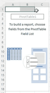
Upon clicking ‘OK’, a placeholder for the pivot table appears. Now comes the critical part – deciding the appearance of the pivot table.
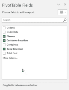
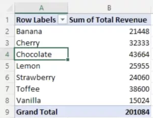
As a starting point, let’s aim to list all the different ice cream flavors our company produces. To achieve this, we drag ‘Flavor’ from the panel on the right and drop it into the rows box. Doing this lists the flavors row by row, sorted alphabetically.
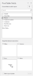
Next, let’s add ‘Total Revenue’ to our pivot table. We can do this by dragging it from the panel and dropping it into the values box. Since ‘Total Revenue’ is numeric data, Excel automatically defaults to summing up the values. However, you can modify this to perform a count, find an average, or obtain other statistics of your choice.
By completing these steps, we have successfully created a simple, yet informative pivot table showcasing a sum of the total revenue for each flavor of ice cream.
This serves as a basic introduction to creating pivot tables, proving just how intuitive and user-friendly they can be for organizing and analyzing large datasets. As we progress, we’ll explore more complex uses and nuances of pivot tables, expanding your data analysis toolkit even further.
Restructuring a Pivot Table
After constructing three differently structured pivot tables, we will now focus on how effortlessly we can reconfigure them. Remember, the flexibility of pivot tables is one of their most potent features.
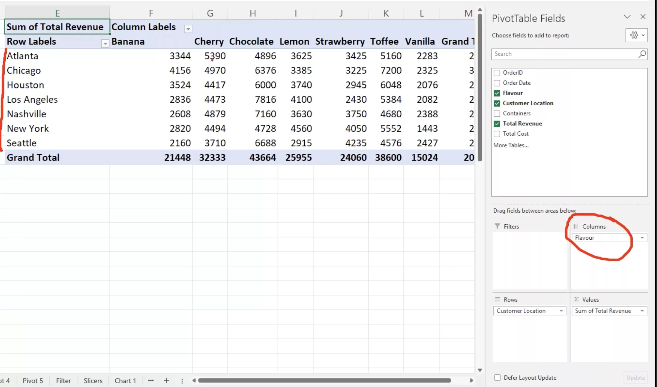
Let’s use one of our created pivot tables as an example. Suppose we wanted to switch the roles of our row and column headers, such that the ‘Flavors’ become the column headings and ‘Locations’ become the row headings. To achieve this, we simply drag ‘Customer Location’ from ‘Columns’ to ‘Rows’, and similarly drag ‘Flavor’ from ‘Rows’ to ‘Columns’. This action instantly alters the table’s structure to match our needs.
In another scenario, let’s say we decide to omit column headings altogether, aiming to create a pivot table that solely lists locations against total revenue. This alteration is also straightforward. We just need to drag ‘Flavor’ out of ‘Columns’, dropping it back into the panel’s list. Doing so effectively removes ‘Flavor’ from the pivot table.
The ability to seamlessly alter the structure of your pivot table is incredibly useful. If you’ve mistakenly added an element or simply changed your mind about the table’s layout, it can be rectified with a simple drag-and-drop action. The capability to reorganize and readjust as needed contributes to the versatility and user-friendliness of pivot tables, making them an indispensable tool in data analysis.
Enhancing the Look of Your Pivot Table:
In the realm of data presentation, the way we format our data can influence the clarity and effectiveness of our report. Pivot tables, while user-friendly, have nuances in formatting that can sometimes trip up a beginner. Here’s how to fine-tune the aesthetics of your pivot table:
1. Renaming Column Headers:
Have you ever been bothered by generic titles like ‘row labels’? Customizing these headers to better describe your data is as easy as a few keystrokes. Let’s break this down:
- Suppose you want to change the header from ‘row labels’ to ‘location’. Navigate to cell E1 (where ‘row labels’ typically resides) and overwrite it by typing in ‘location’.
- Similarly, if you’d prefer the label ‘flavor’ over ‘row labels’, simply type ‘flavor’ in the appropriate cell.
2. Adjusting the Grand Total Label:
While ‘Grand Total’ is self-explanatory, perhaps you’d like a more concise term. By overwriting ‘Grand Total’ with ‘Total’, you can achieve a cleaner look.
3. Naming Conflicts and Solutions:
Things get a tad tricky when you wish to rename a column header with a title that already exists in your dataset.
- For instance, you might find ‘Sum of Total Revenue’ a mouthful and want to simplify it to ‘Total Revenue’. However, upon pressing enter, you’ll be greeted with an error indicating the name already exists. This is because ‘Total Revenue’ is possibly a title in your list of data.
- A clever workaround for this is to append a space after your desired name. For the previous example, typing ‘Total Revenue ‘ (with an additional space) sidesteps the naming conflict.

Sorting in Pivot Tables without Resetting Column Widths
Pivot tables in Excel are powerful for data analysis but come with quirks. One such challenge is the resizing of columns when you sort, filter, or refresh your table.
The Issue: When you sort data within a pivot table, Excel tends to reset the column widths back to their default settings. If you’ve customized your column widths for readability or design, this can disrupt your layout.
How to Preserve Your Column Widths During Sorting:
- Set your desired column widths.
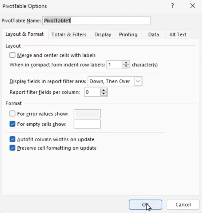
- Click on the ‘Analyze’ tab.
- Select ‘Options’ on the left side of the ribbon.
- Uncheck ‘Auto fit column widths on update’ and hit ‘OK’.
- Now, when you sort (e.g., right-click and choose ‘Sort’), your column widths stay intact.
Remember, pivot tables are dynamic, and while they auto-adjust, a few tweaks can keep them just the way you want.
Counting Entries in Pivot Tables
Excel’s Pivot Tables offer versatile ways to manipulate and visualize data. One common task is to count specific entries, and here’s how to achieve that:
The Scenario: You have a dataset with around 1600 rows, representing orders. You want to find out how many orders were made for each flavor.
Steps to Count Entries per Flavor:
- Using Existing Fields:
- Click inside your pivot table.
- Drag the ‘Total Revenue’ (or any numeric column) into the ‘Values’ box again. By default, it will sum the values.
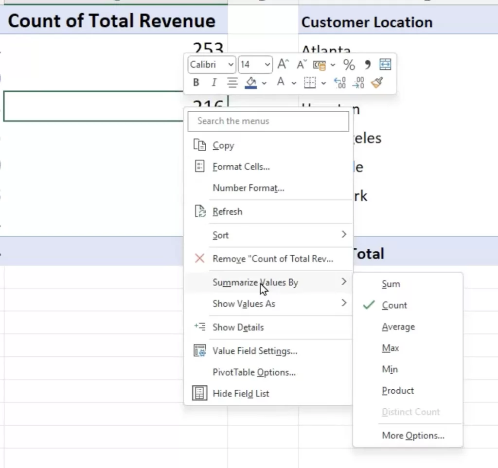
- To change it to a count, right-click on one of the numbers in the new column.
- Choose ‘Summarize Values By’ and then ‘Count’.
- Note: You’ll need to adjust the column formatting if it shows as currency.
- Using Non-Numeric Fields:
- You can also drag a non-numeric field, such as ‘Order ID’, into the ‘Values’ section. Since it’s non-numeric, Excel defaults it to a count.
- Again, make sure to adjust any unsuitable formatting.
Now, your pivot table displays both total revenue and order count for each flavor or item.
In Conclusion
Excel’s Pivot Tables remain an indispensable tool for data analysis, offering flexibility, efficiency, and intuitive functionalities that empower users to extract valuable insights from their data. As we’ve seen, simple maneuvers like sorting, counting, and even the more intricate task of filtering can be executed with ease. Whether you’re a novice just dipping your toes into the expansive pool of Excel features or a seasoned professional, understanding these pivot table techniques can greatly enhance your data processing prowess. As with any skill, the key lies in consistent practice and exploration. So, dive into your datasets, experiment with these features, and unlock the full potential of your data with Excel’s Pivot Tables.