
 Organizing the delivery of project scope into sprints provides stakeholders with an opportunity to objectively assess progress at regular intervals. Comparing what was delivered against what remains in the overall release or project backlog helps us understand when we might be done. Looking at what the team was able to complete in relation to what they committed to complete at the beginning of the sprint can help us assess their self-discipline and delivery maturity.
Tools such as sprint burn-down, velocity and release burn-up charts can provide stakeholders with the power to interpret how a team is doing, but as usual, with great power comes greater responsibility.
Let’s look at two examples which illustrate the danger of drawing conclusions from such charts.

At first glance, the sprint burn-down chart above might be a sign that a team is not delivering in an agile manner and are batching work items till the very end of their sprints which would seem to indicate immaturity.
But before jumping to conclusions, what else might cause a similar sprint burn-down pattern?
- Work items have actually been completed but the supporting work item tracking tool has not been updated yet. This would be an indicator of poor discipline but not necessarily immaturity.
- The pod’s Definition of Done includes a task which can only be completed at the very end of sprints – for example, testing within a shared environment, or the completion of independent testing by a team outside of the pod. This should not be a cause for concern if such a constraint cannot be avoided.
How about the following velocity chart which illustrates what a pod has completed compared with what they committed to complete for three sprints?
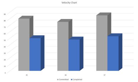 One conclusion could be that this is an immature pod as they are chronically over-committing and under-delivering. But another interpretation is that the sponsor or some other senior stakeholder is the one demonstrating poor behavior by ignoring the better judgment of the pod and mandating the number of work items which have to be completed each sprint. Addressing that issue will be very different than if the former interpretation is the accurate one.
You can use all the quantitative data you can get, but you still have to distrust it and use your own intelligence and judgment – Alvin Toffler


Pingback: What stories do your charts tell? – Better Time Management