Proggio Essence – Real-Life Example of the “New Normal”
It is said that “A picture is worth a thousand words” and indeed, screenshots are the best way to explain Proggio’s unique approach to the new-normal. Moreover, Proggio is practicing this adage in project management, and using it to make project collaboration clear and simple.
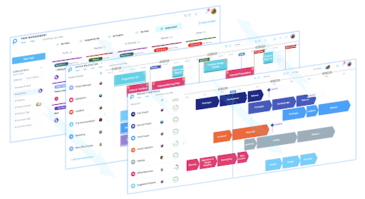
Let’s see a real-life example of screenshots taken from Proggio, where it all starts with a birds eye view.
In this example we are using a made-up company of course, but you may most likely find resemblance to yours. “The Company” is running several Development and Operations projects, in various stages and timing. In addition, they’re working on a vendor selection project, facelifting their website, preparing for a sales event and also moving to their new HQ office .
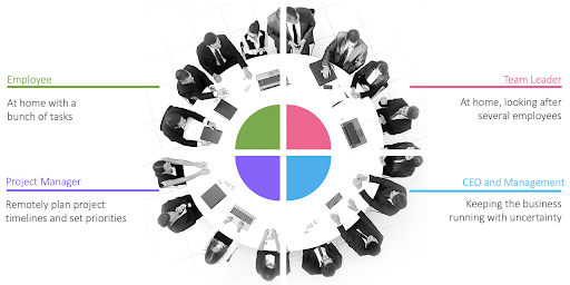
Covid19 affects the workspace significantly. People are no longer sitting around the same table and sharing an office space. This is a challenge many companies are facing, under different titles of course, and it just became harder these days with Covid19 around (Read more on ‘How Covid-19 affects project management?’). So how is this challenge being handled remotely with Proggio?
Think about Proggio as using the visual interface of Google maps. Using Google maps you can look at the entire Europe, then zoom into France in order to see Paris and the Eiffel tower. You are moving top-down from seeing a lot of information without details to seeing smaller areas with more details.
Proggio is using the same concept to show projects, from the top layer, seeing multiple projects in a bird’s eye view all the way down to the very details, all using the same visual language and the same source of information. We are going after Google maps for a reason – we believe that this is the way to show information in 2020, in layers. This is how people are using touchscreens – double tap the screen to see more data and click back to the upper layer again. This is a modern information presentation, and Proggio utilises it for your projects – from Portfolio, to a single project and a single task.
In 2020, people are no longer scrolling pages on their screen. They are not expecting information to be divided into multiple rolling pages. This is one of the reasons why traditional Gantt charts seem so outdated.
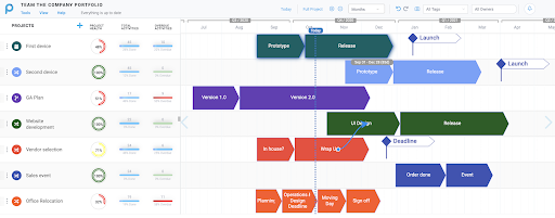
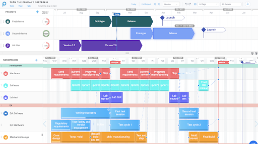
In Proggio’s portfolio view, each line presents a high level view of a project. “First project”, “Second project”, “Vendor selection” and ‘Moving to a new office’ displayed on the left side are the project names. The default view of the Project Portfolio represents projects’ milestones from the project plan timeline as arrow shapes.
The (Blue dotted) “Today” line crosses through the board to show which milestones are behind us, and which milestones are waiting down the road. Before going into details, a company portfolio can be explained clearly in a matter of seconds.
Portfolio status analytics
Proggio’s Portfolio may look like a slide, but it is not a slide. It is all based on planning and tracking data of underlying layers. Tracking indicators and project statistics are here to show how your projects are doing.
Looking at the progress KPI, 95% means that everything is on track – most of the tasks planned until today are done. 48% means that something clearly went wrong. You can then expand the left tile to inspect additional information about this delay.
A single click on the project will display the underlying project plan in a split screen mode, showing the portfolio on the top, and a single project at the bottom. This view allows moving from one project to another while the project plan is switched and reviewed in the lower part of the screen.
After viewing high level data, you will probably want to go into the project itself to see what went wrong. Thats easy! Simply double click the project arrows, and the application will redirect you into the specific project.
Project plans can look that good! A single project view
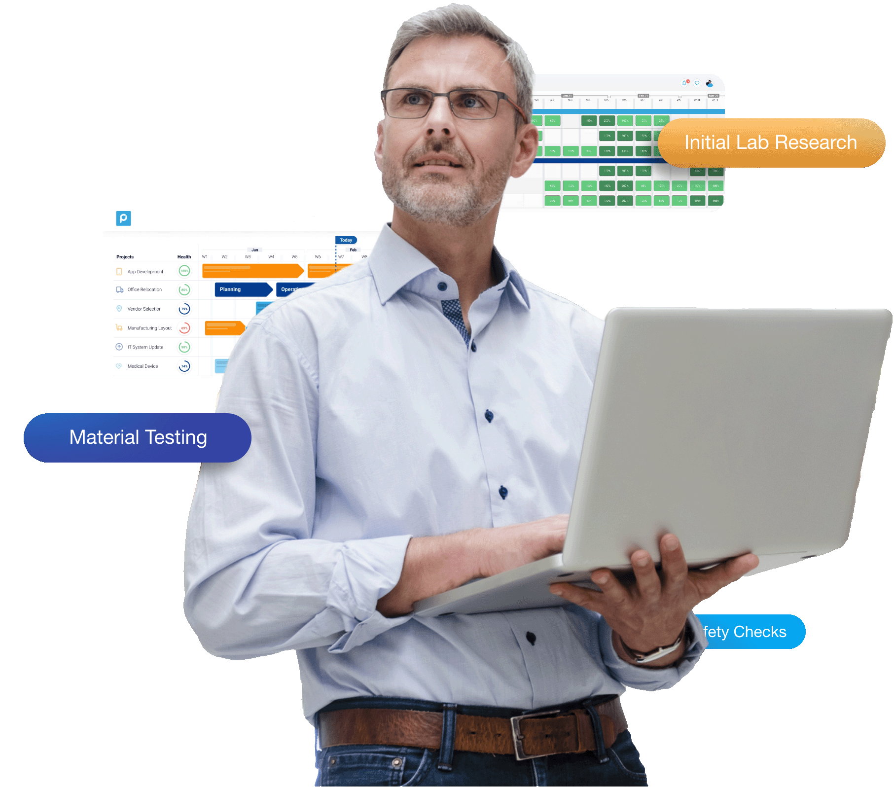
A single project view is keeping the same visual language of the portfolio view, but with more details. In this case, we drilled down into the “Office Relocation plan”.
Here, each line is a “Workstream” or an area of activity. The workstream structure is unique to Proggio and helps you see how Operations activity (for example) is planned alongside logistics, IT and marketing. The white lines inside each activity represent a progress – “Lab preparations” is done, “Writing test cases” is half way through, and “Lab Test” not started.
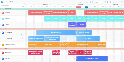
Again, the Today line helps you put everything in perspective. The white progress lines visually determine the project status – you always expect the white progress line to reach or even move ahead of the ‘Today’ line. In the QA: Software Workstream for example, you can visually see the delay, where activity ‘Writing test cases’ hasn’t been reported as completed. Note that the application not only presents it visually with a red exclamation mark, but also sends you a notification about that.
With a single project view, the project structure is very clear. You can plan it in one location and share it online with other people wherever they are. It is like a block diagram, and they will understand the structure even without you.
Get work done! The task management view
Now that the project structure is clear, you can see more data and dive into each activity to see the To-Do items. There are several options to review the project underlying tasks:
- Click once on any activity within the project plan to review the tasks in a split-screen mode.
- Double click any activity to review the tasks in a pop up dialog, gateway-ing you to additional information and features, such as chat, attach files, add checklists, budget information and more.
- Navigate directly to the task management view from the left side panel.
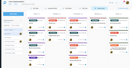
The various views in the Task Management help employees execute their planned tasks in order to make progress over the timeline. You can monitor progress, and dive into additional information provided for each task. Most importantly, you can choose to highlight only the ‘Overdue’ tasks across your portfolio or focus on the higher priority assignments. The task list is available with both kanban boards and task lists. Members in the team can use many sort options and filters according to their needs.
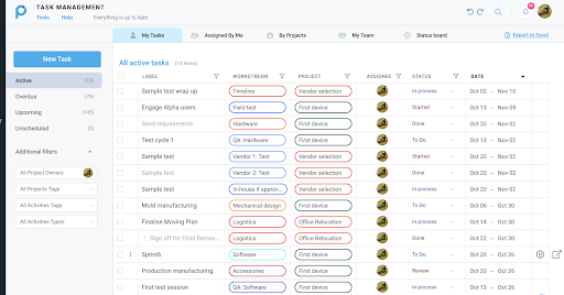
This is a more tactical view, explained in details within our task management guide. Your end users are sometimes just owning tasks, and they are less interested in viewing the timeline. This view helps you give them exactly what they need, in the most simple way – their assignments for today, this week, or per project.
The Proggio Magic and Patent – connecting project teams wherever they are
The magic of Proggio happens when all these views are actually driven from the same information. You can review the information in the task layer, project timeline or in a high level portfolio, but you are still looking at the exact same information.
This means that when your employee changes a task status from home, it immediately moves a white progress line in the project layer, and the tracking indicator in the portfolio layer – all available for managers in other locations. Each one is getting the view they need, while looking at the same data set.
The information that was presented over timelines, can be presented also as a resources management tool. It is like an Excel pivot table. Once we have several projects up and running and tasks assigned to people, we can review employee loading information and use it to monitor resources capacity and utilization.
The resources management interface is quite sophisticated and allows assigning partial time, capturing employee skills and calculating the effort in percentages or in effort points.
Try it yourself – review Proggio free trial now!