


Projects are getting increasingly complicated every day, and this is not a generic statement.
A survey by McKinsey & Company has found that around 24% of cost overruns in IT projects eventually lead to project failures are because of unclear objectives and unrealistic schedules.
Sadly, a lot of project managers who are new in the field are unaware of the importance of data visualization. When dealing with a complex project, it’s essential to use project management charts and diagrams to plan, schedule, and monitor tasks efficiently.
If you’re new to project management, this video can be a good resource –
And for the rest, you can walk straight to the blog, where I’ll discuss the 15 best project management workflow charts and diagrams.
What Is a Project Management Chart?
In simple terms, a project management chart (or a table or diagram) is a graphical representation of your project plan. It translates data and tasks into a visual format everyone can understand – fostering collaboration and boosting project efficiency.
Now, what’s exactly the reason for all this hype with these charts, tables, and diagrams?
To answer that, let me give you an example of a Gantt chart (you’ll read in more detail in the list below) –
Imagine you’re from your company’s HR department. Instead of browsing through lengthy documents, you can have a clear visual roadmap that shows everyone which tasks are nearing completion, which is to be done first (dependencies), etc. This saves time, reduces confusion, and ensures everyone’s aligned on project goals.
(Image source: ProProfs Project)
15 Best Project Management Charts & Diagrams
I covered 15 of the best charts and diagrams project managers should use in the list below. You may have already heard or used some of these before. So, I decided to show the pros and cons, as well as some ideal use cases to help you learn something.
Let’s get started.
1. Gantt Chart
Gantt charts are a classic example of using a chart to view the project timeline.
It uses horizontal bars to represent tasks, with their length indicating duration. You can also see dependencies (which tasks need to be completed before others can start) and easily identify critical paths, i.e., the task sequence that determines your overall project timeline. You can find Gantt charts in almost all major project management software.
Ideal Use Cases:
Perfect for linear projects with well-defined tasks and dependencies (e.g., product development, construction).
Pros:
- Easy to understand
- Great for scheduling and tracking real-time project progress
Cons:
- Can get cluttered with complex projects
- Limited flexibility for visualizing resource allocation
Suggested read: Gantt Chart Dependencies: Types and Importance
2. Flowchart
Flowcharts map out the steps involved in a process, including decision points and their corresponding outcomes. They highlight project goals and the key activities needed to achieve higher efficiency.
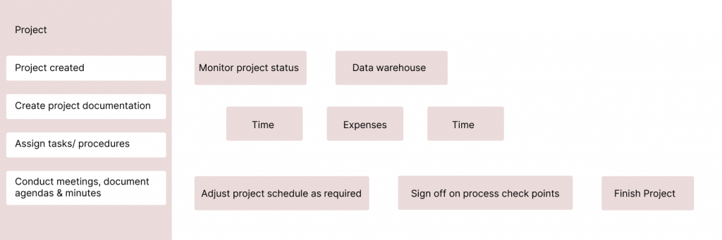
(Image source: ProProfs Project)
I can say they’re like visual roadmaps. Using a flowchart, you can identify potential issues and optimize workflows by highlighting decision points and potential bottlenecks.
Ideal Use Cases:
Onboarding new employees, troubleshooting technical problems, and mapping out customer journeys.
Pros:
- Excellent for process visualization and identifying bottlenecks
- Useful for documenting complex standard operating procedures (SOPs)
Cons:
- Can get complex for intricate processes
- May require additional explanation for non-technical audiences
3. PERT Chart (Program Evaluation and Review Technique)
Developed by the US Navy in the 1950s, this project chart is usually utilized after the initial project planning stage.
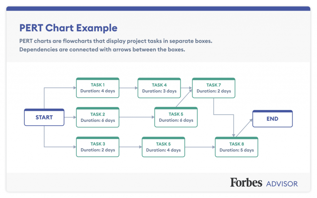
(Image source: Forbes)
PERT charts use estimated task durations to calculate project completion timelines with probabilistic ranges. They account for the inherent uncertainty in project tasks, providing a more realistic picture of potential delays.
In my opinion, a PERT chart enhances project transparency for managers, providing more accurate clarity on the time required for essential and non-essential tasks. When combined with effective time management strategies, these can integrate best practices into daily operations, improving project outcomes and ensuring successful completion.
Ideal Use Cases:
Complex projects with a high degree of uncertainty in task durations (e.g., research & development) and projects with tight deadlines where understanding potential delays is crucial.
Pros:
- Accounts for uncertainty in task durations
- Helpful for identifying potential delays and mitigating risks
Cons:
- Requires more time and effort to create compared to simpler charts
- May be overwhelming for non-statistical users
4. Pareto Chart (80/20 Rule)
Ever heard the saying? “80% of the results come from 20% of the effort?” The Pareto Chart brings this concept to life.
It’s a bar chart where bars are arranged by height, with the tallest bar representing the most frequent cause (problem, defect, etc.). This helps you prioritize efforts by focusing on the factors contributing to the majority of issues.
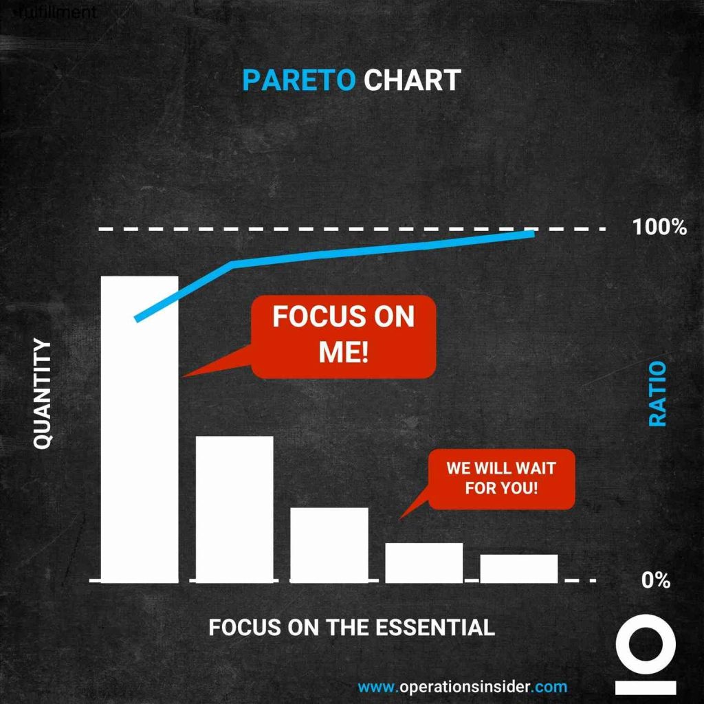
(Image source: Operations Insider)
Ideal Use Cases:
Identifying root causes of quality defects, analyzing customer complaints, and prioritizing sales efforts.
Pros:
- Prioritizes problem-solving efforts
- Helps identify areas for maximum improvement
Cons:
- Limited to showcasing a single category and its contributing factors
- Ignores interdependencies between causes
5. Cause-and-Effect Chart (Ishikawa Diagram)
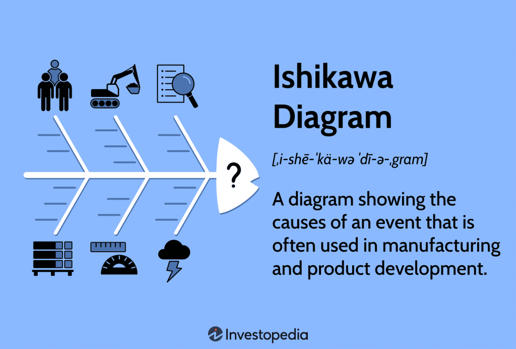
(Image source: Investopedia)
Also known as a fishbone diagram due to its shape, this chart helps pinpoint the root causes of problems.
The “fishbone” branches out from a central problem statement, with each branch representing a potential category of causes (e.g., manpower, materials, methods, machines). By brainstorming within each category, you can identify the root cause and develop solutions.
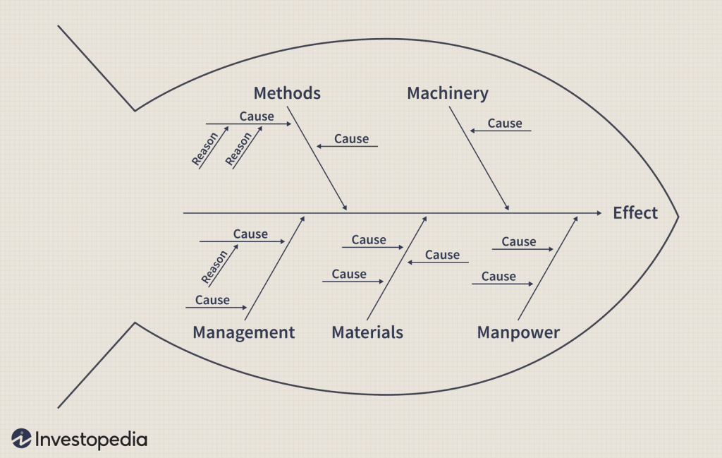
(Image source: Investopedia)
Ideal Use Cases: Identifying root causes of product defects, troubleshooting technical issues, and analyzing project delays.
Pros:
- Excellent tool for root cause analysis
- Promotes team collaboration
Cons:
- Can become unwieldy with complex problems
- Subjective interpretation of causes
6. Kanban Board
This is another very common example of a project management table. You may have seen those board-like columns that represent different stages of your project workflow (e.g., “To Do,” “In Progress,” “Done”). Can’t recall? No worries; check this quick video –
In Kanban boards, tasks are depicted as cards that move across the board as they progress. This visual system allows you to limit the number of “Work in Progress” tasks, preventing bottlenecks and ensuring smooth workflow.
Ideal Use Cases: Software development, marketing campaigns, any project with a visual workflow and frequent task updates.
Pros:
- Simple, flexible, and perfect for agile methodologies
- Offers a real-time view of workflow bottlenecks and helps manage workload
Cons:
- Limited task detail view
- May oversimplify complex tasks
Suggested read: 15 Kanban Boards Examples For Teams in 2024
7. Control Chart
The Control Chart (also called the Statistical Process Control Chart) is a valuable tool in project management for tracking recent updates to projects.
Control charts track a specific process metric (e.g., cost, time, quality) over time, with statistically determined upper and lower control limits. Any data points falling outside these limits signal potential problems requiring investigation.
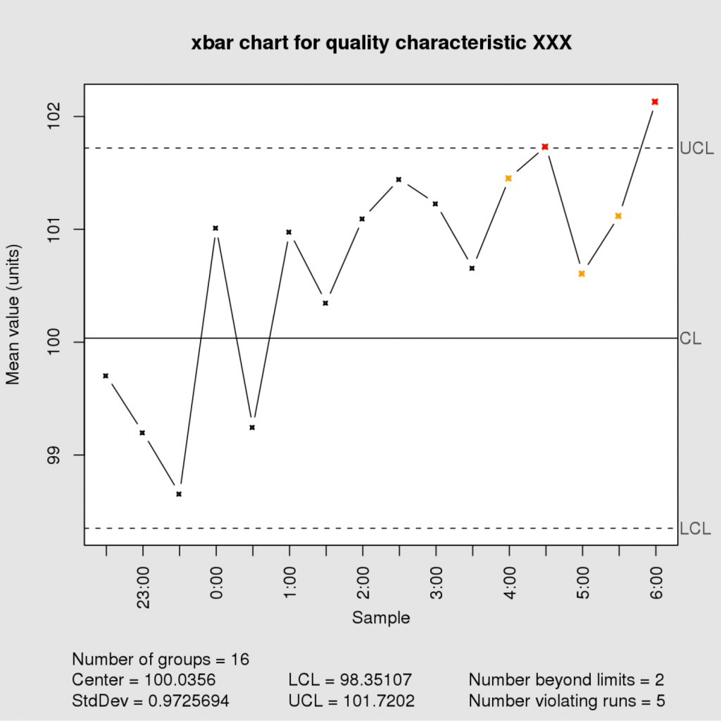
(Image source: Wikipedia)
Additionally, it assists in overseeing the Cost Performance Index (CPI) and Schedule Performance Index (SPI) – key project financial and scheduling health indicators.
Ideal Use Cases: Manufacturing processes, monitoring project costs or schedule adherence, tracking software defect rates.
Pros:
- Proactive monitoring of project performance
- Helps identify and address issues before they snowball
Cons:
- Requires some statistical knowledge to set up and interpret
- May not be suitable for all project types
8. RACI Matrix (Responsibility, Accountability, Consultation, Inform)
This table-based chart clarifies roles and responsibilities for project tasks. Each task is listed and then assigned an R, A, C, or I for each team member involved.
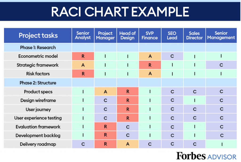
(Image source: Forbes)
Here’s a breakdown of what the RACI Matrix translates into –
- R = Responsible for completing the task
- A = Accountable for the final outcome
- C = Consulted before decisions are made
- I = Informed about the task’s progress
With the help of the matrix diagram, you can easily know about the involvement of each team. In addition, you get a clear idea of deliverables with an RACI matrix during the project lifecycle.
Ideal Use Cases: Project teams with diverse roles, clarifying ownership of deliverables and decision-making authority.
Pros:
- Ensures clear ownership and communication of project tasks
- Helps you avoid confusion and duplication of efforts
Cons:
- Can become cumbersome for large teams or complex projects
- Requires ongoing maintenance as project roles evolve
9. SWOT Analysis
Standing for Strengths, Weaknesses, Opportunities, and Threats, this strategic planning table helps you assess your project’s internal and external environment. By analyzing these four factors, you can identify areas for improvement, capitalize on opportunities, and mitigate potential threats.
Here’s an example of how to do a SWOT Analysis –
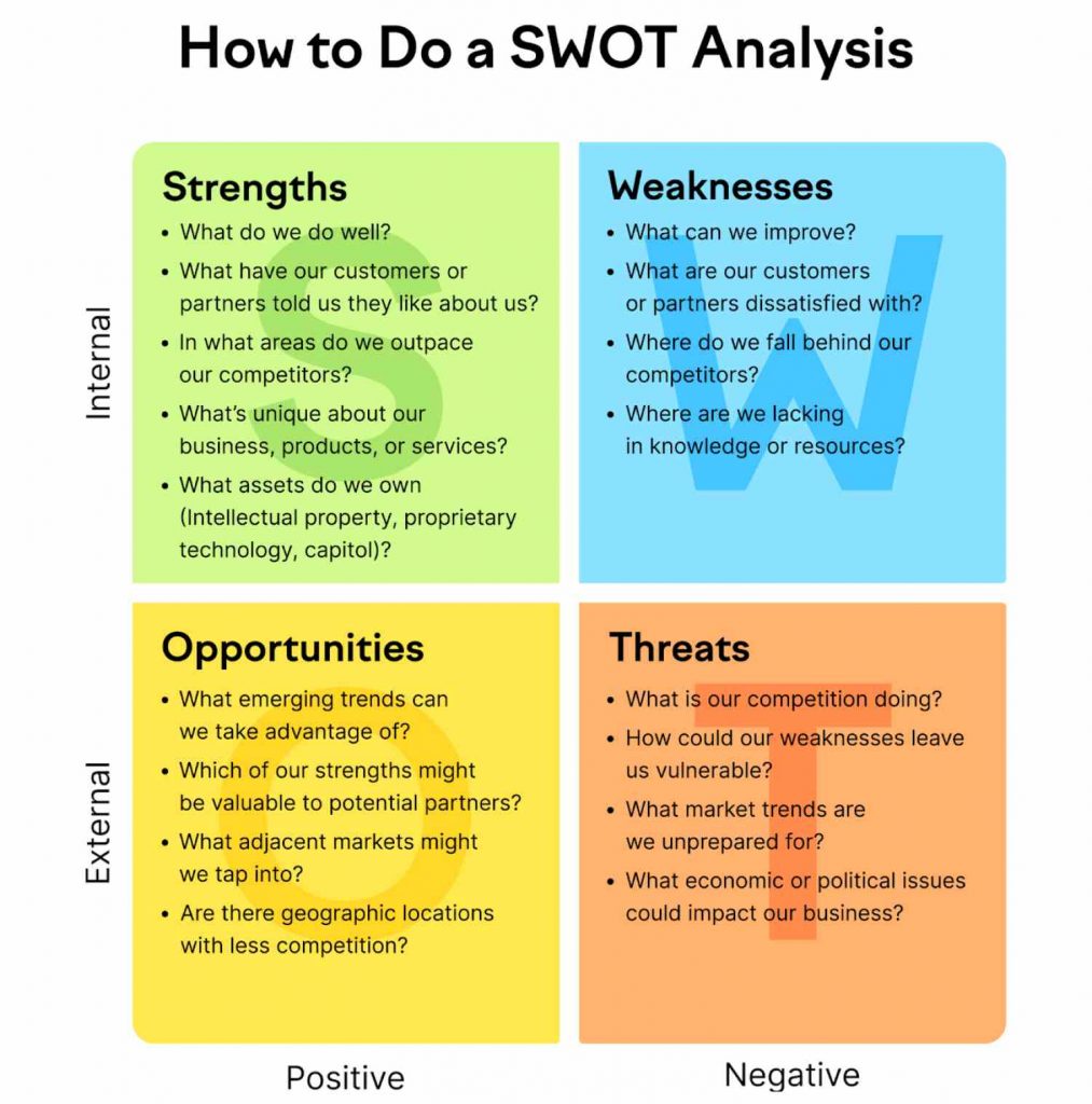
(Image source: Semrush)
Ideal Use Cases: Project planning, business development, competitive analysis for product launches or marketing campaigns.
Pros:
- Provides a comprehensive view of your project’s competitive landscape
- Facilitates strategic decision-making
Cons:
- Effectiveness relies on a team’s honest and objective evaluation
- Requires regular updates to remain relevant
Read more: SWOT Analysis | A Way to Boost Project Success Rate
10. Work Breakdown Structure (WBS)
Think of this as a hierarchical project blueprint. It breaks down your project into smaller, more manageable deliverables, ultimately achieving the final project goal.
The WBS is a tree-like structure, with the project objective at the top, further divided into sub-deliverables and tasks. It ensures a clear understanding of the scope and components of your project.
Here’s how a WBS will look for a construction project –
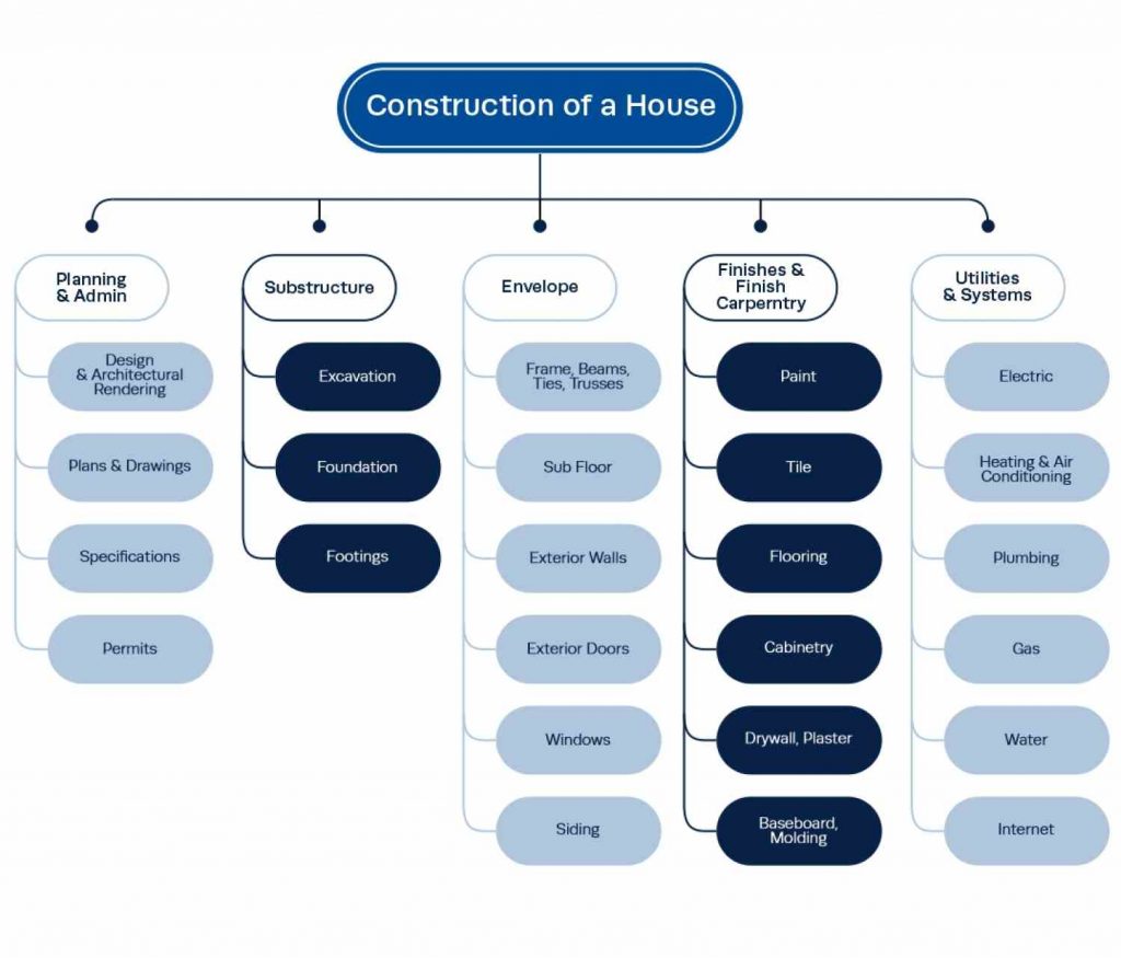
(Image source: Institute of Project Management)
Ideal Use Cases: Complex projects with multiple deliverables, ensuring a comprehensive project scope and facilitating task delegation.
Pros:
- Excellent tool for project planning and scope definition
- Promotes clarity and facilitates task delegation
Cons:
- Requires careful planning and attention to detail to avoid missing crucial components
- Time-consuming to create
Want to know more? Read –
What is Work Breakdown Structure (WBS) in Project Management? Type & Guidelines
11. Timeline Schedule
This is a simple yet powerful tool for visualizing your project schedule. Unlike Gantt charts focusing on tasks, timeline schedules present a linear view of project phases or milestones over time.
This straightforward approach is perfect for highlighting key project stages and deadlines. And it looks something like this –
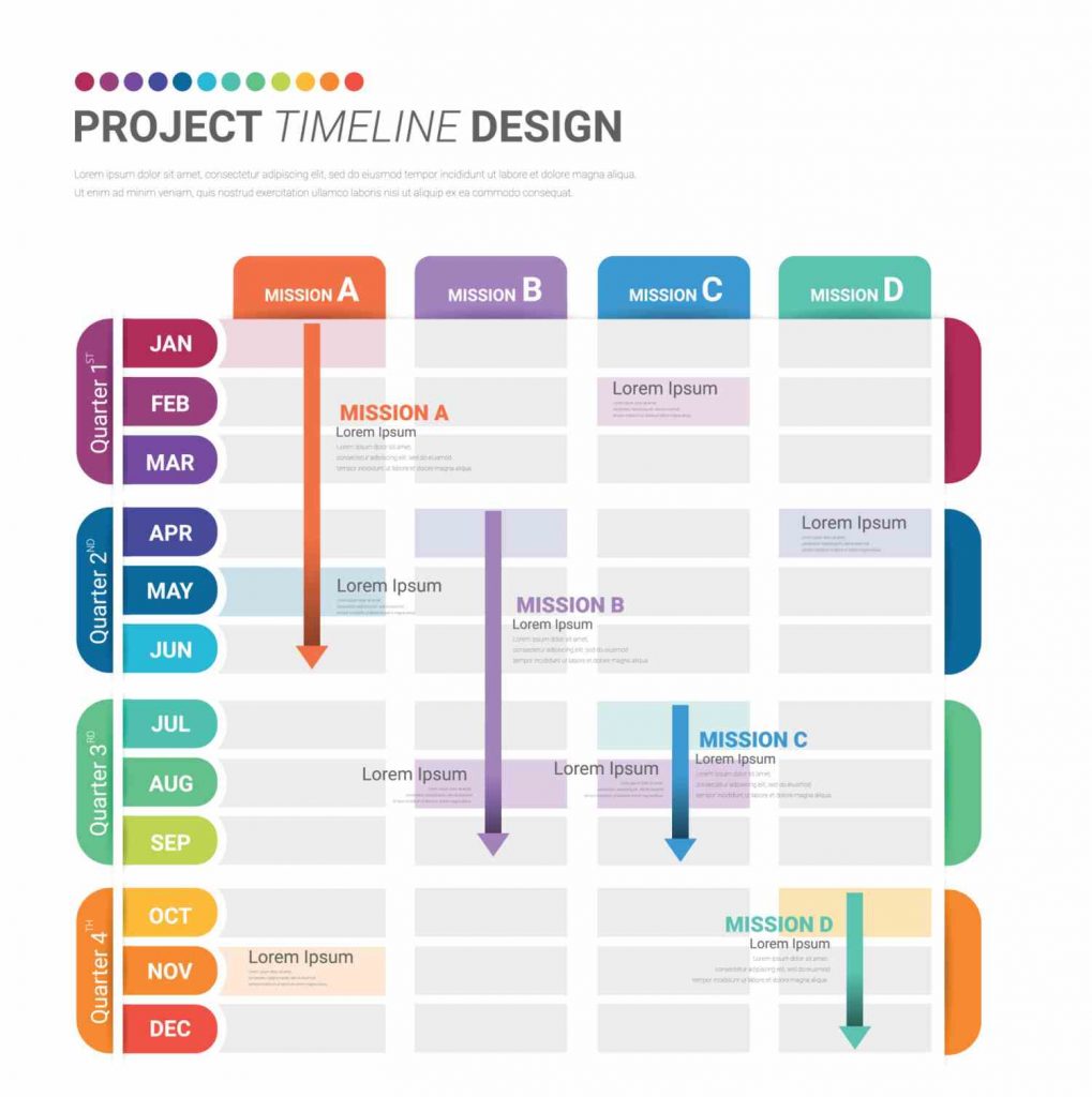
(Image source: Vecteezy)
Ideal Use Cases: High-level project overview, communicating key milestones to clients or executives, project presentations.
Pros:
- Easy to understand and communicate project timelines to stakeholders
- Promotes transparency and milestone awareness
Cons:
- Limited detail on task dependencies or resource allocation
- Can become cluttered with too many activities
Suggested read : 9 Emerging Project Management Trends in 2024.
12. Pie Chart
While not as common as other project management diagrams on this list, pie charts can help visualize the proportional distribution of a specific category. These are circular charts divided into sectors, illustrating numerical proportions.
For example, a pie chart could represent the project budget allocation across different departments or resources.
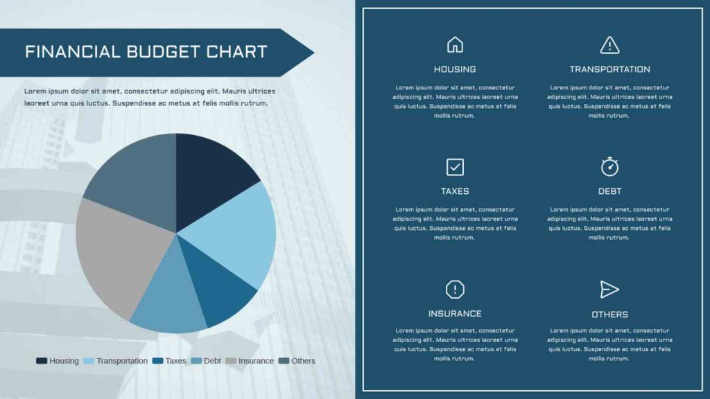
(Image source: Visual Paradigm Online)
Ideal Use Cases: Presenting budget allocation, resource distribution across teams, and customer demographics (limited to a single variable).
Pros:
- Easy to understand for presenting proportional data
- Visually appealing way to showcase breakdowns of a single category
Cons:
- Limited to showcasing a single data set
- Can become cluttered with too many slices
13. Critical Path Method (CPM) Diagram
This network diagram identifies your project’s critical path—the sequence of tasks that determines the minimum overall project duration.
CPM considers task dependencies and durations to pinpoint the critical path, highlighting tasks with zero slack (buffer time) that could delay the entire project if not completed on time.
Here’s how a CPM diagram will look like if your project is…say, baking a cake –
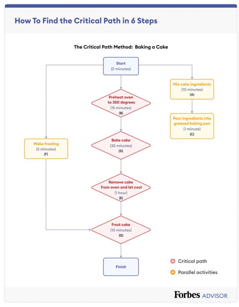
(Image source: Forbes)
Ideal Use Cases: Large-scale construction projects, complex software development initiatives, and any project with critical deadlines and intricate task dependencies.
Pros:
- Advanced tool for scheduling complex projects with tight deadlines
- Helps identify buffer zones and potential bottlenecks
Cons:
- Requires project management software and some expertise to create and interpret
- Needs constant updating
14. Cumulative Flow Diagram (CFD)
This project management chart tracks the number of work items in each stage of your workflow over time. It helps visualize bottlenecks and identify areas where work gets stuck.
By analyzing the slope of the lines in the CFD, you can assess workflow efficiency and identify areas for improvement. It looks something like this –
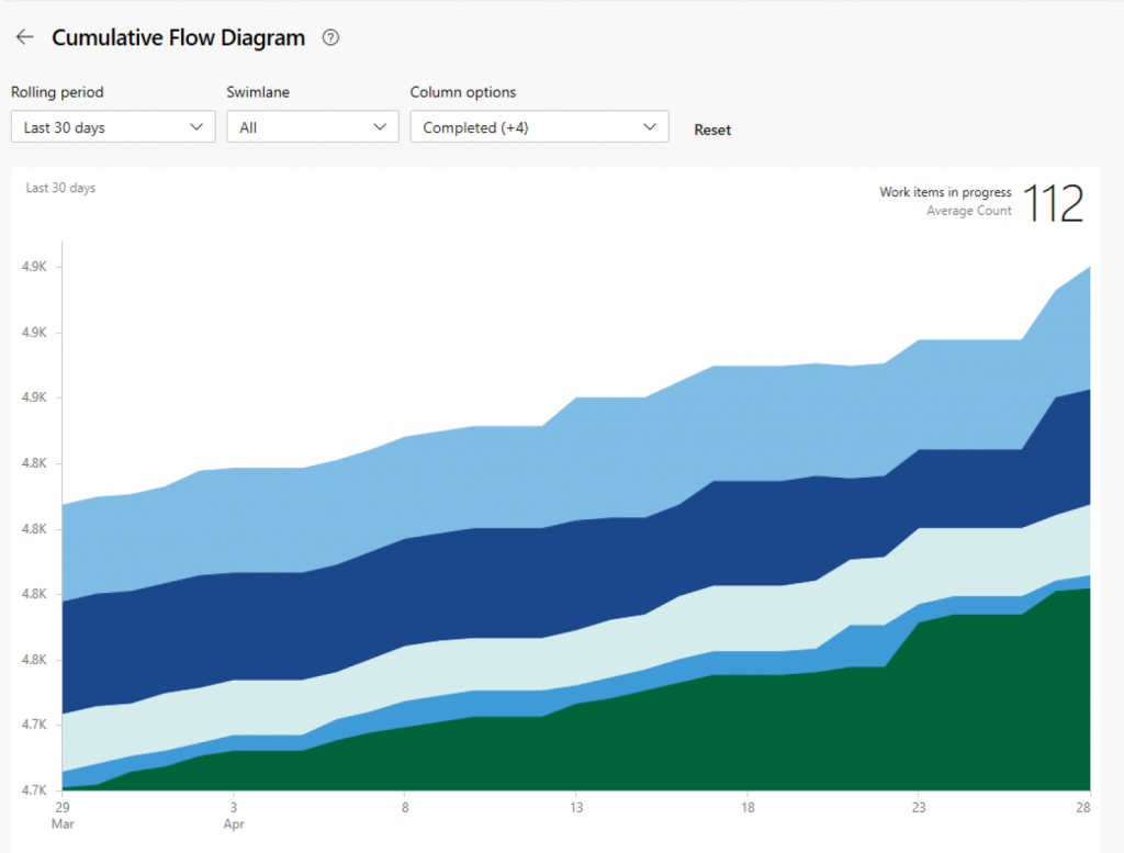
(Image source: Microsoft)
Ideal Use Cases: Agile project management methodologies, Kanban workflows, identifying bottlenecks, and optimizing workflow efficiency.
Pros:
- Provides valuable insights into workflow bottlenecks and WIP (work in progress) levels
- Facilitates continuous process improvement
Cons:
- Requires ongoing data collection
- May not be intuitive for everyone
15. Burnup/Burndown Chart
These charts are like progress meters for your project backlog (list of tasks).
A burnup chart tracks the total amount of work completed over time, typically depicted as a line moving upwards. Conversely, a burndown chart focuses on the remaining work, visualized as a line ideally trending downwards towards zero as tasks are completed.
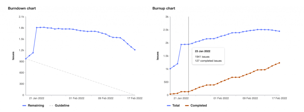
(Image source: GitLab Documentation)
Both charts provide a visual representation of progress, helping identify potential roadblocks and ensuring the project stays on track.
Ideal Use Cases: Agile methodologies, tracking backlog completion in sprints, monitoring overall project progress towards deadlines.
Pros:
- Simple and easy to understand
- Offers real-time insights into project progress
Cons:
- Limited detail on individual tasks
- May not be suitable for complex projects with frequent scope changes
Drive Your Road to Success With the Best Project Management Charts
Visualizing project data is a must to ensure projects run within the risk limits and are completed on time. Modern-day project managers make use of all these workflow charts and tables discussed above.
That not only helps them in project planning and monitoring processes but also streamlines communication, boosts efficiency, and ensures project success.
Consider exploring software options like ProProfs Project, where you can utilize Gantt charts, Kanban boards, and various other project management charts effortlessly.
The best thing? You don’t even need to pay first, as most of these software solutions offer a freemium plan or free trial. By signing up for free, you can take your project management game to the next level with efficient visual diagrams.
Learn More About Project Management Charts
Which type of chart is used primarily for project management?
Among all the charts discussed above, a Gantt chart is primarily used for project management. You can use it for real-time project progress, effective project handling, and more. A Gantt Chart enables the following –
- Easier task scheduling
- Convenient time tracking via clear and visual representation of project progress
- Accurate execution of project plans by adding task dependencies
What should be included in a Gantt chart?
Although the Gantt chart is the best of its kind, there is still room for more improvement. So, it would be great if you added things like a dependent task, critical path, color coding, etc., into your chart.
What is the difference between a Gantt chart and a PERT chart?
The main difference between a Gantt and a PERT chart is –
Gantt charts are basically bar charts, while PERT charts are flow charts. Although both these charts make the task of project management easier, what makes a PERT chart less preferable is that it can be very confusing and complex at times. This is not the case with a Gantt chart.
Do you want a free Project Management Software?
We have the #1 Online Project Management Software for effective project management.