Remove pareto-chart
article thumbnail

How to Create an Easy Pareto Chart to Highlight Your Biggest Opportunities

Project Bliss

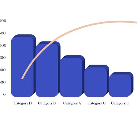
A Pareto chart is a bar especially designed to show information in descending order. If you’re not analytically inclined, don’t let the idea of creating a Pareto Chart put you off. When you’re looking for ways to improve quality and want to know where to focus your efforts, a Pareto can point the way.

article thumbnail

Production Capacity: Formula, Examples

ProjectManager.com

Use our robust Gantt charts to schedule resources and costs for specific tasks. ProjectManager’s Gantt charts help you schedule resources to help with production capacity. ProjectManager is award-winning project management software that helps manufacturers identify and map out resource usage. You can also list each person’s skills.

Insiders

Sign Up for our Newsletter

This site is protected by reCAPTCHA and the Google Privacy Policy and Terms of Service apply.

article thumbnail

How to Build Your Project Backlog In 5 Steps

ProjectManager.com

You can use a project management tool such as kanban boards, Gantt charts or a task list that show the percentage complete. It’s important to remember the Pareto rule as well when you’re delivering and developing your product backlog. Dashboards and reports also help track progress.

article thumbnail

125 Project Management Buzzwords

The IIL Blog

Burndown Chart A tool in Agile project management that tracks the work completed and the work remaining to help teams manage progress. Gantt Chart A horizontal bar chart that displays tasks or activities along a timeline, showing all work packages and/or activities and their dependencies from the start to the end of a project.

article thumbnail

Pareto Charts and the 80/20 Rule

Deep Fried Brain

A Pareto Chart or Diagram, one of the Seven Basic Quality Tools, is a specific type of Histogram ordered by frequency of occurrence.

34
article thumbnail

Histogram as a Component of Seven Basic Quality Tool

iZenBridge

A specific form of bar chart used to represent the central tendency, dispersion, and pattern of a statistical distribution. Difference between Pareto Chart and Histogram: Histogram. Pareto Chart. The Histogram is a kind of bar chart showing a distribution of variables or causes of problems.

article thumbnail

Total Quality Management (TQM): A Quick Guide

ProjectManager.com

Control chart to determine if a process is in a state of control. Stratification (or flow or run) chart to sample a group. Pareto chart, which is both a bar and line graph that assess the most frequently occurring defects by category. These tools are often used in Six Sigma as well.